


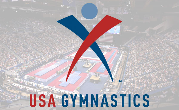

INDIANAPOLIS, Aug. 6, 2013 – USA Gymnastics is celebrating its 50th anniversary during the 2013 P&G Gymnastics Championships in Hartford, Conn. The organization is taking advantage of the milestone to update its current logo, moving to bolder colors and modernizing the fonts and look. The new moniker was used as part of the 50th anniversary mark and the complete logo appears on signage and other materials in Hartford.
“We felt now is a good time to refresh our mark,” said Steve Penny, president of USA Gymnastics. “The brand mark has been well-received by our community, which made it important to build on the integrity of what already exists. This update creates a somewhat friendlier impression while re-enforcing the boldness of our efforts on behalf of the country.”
The 2013 version features a deeper red and blue, a new font and a retooled graphic. The organization will transition to the new logo following the P&G Championships.
After the conclusion of the P&G Championships, USA Gymnastics will provide its state and regional administrative committees and member clubs with a “tool kit,” which will provide them with guidelines, fonts and artwork to incorporate the new mark into their websites and other official materials.
The Indianapolis-based 360 Group, which created the original mark that was adopted in 2003, refreshed the logo and created the accompanying materials for usage.